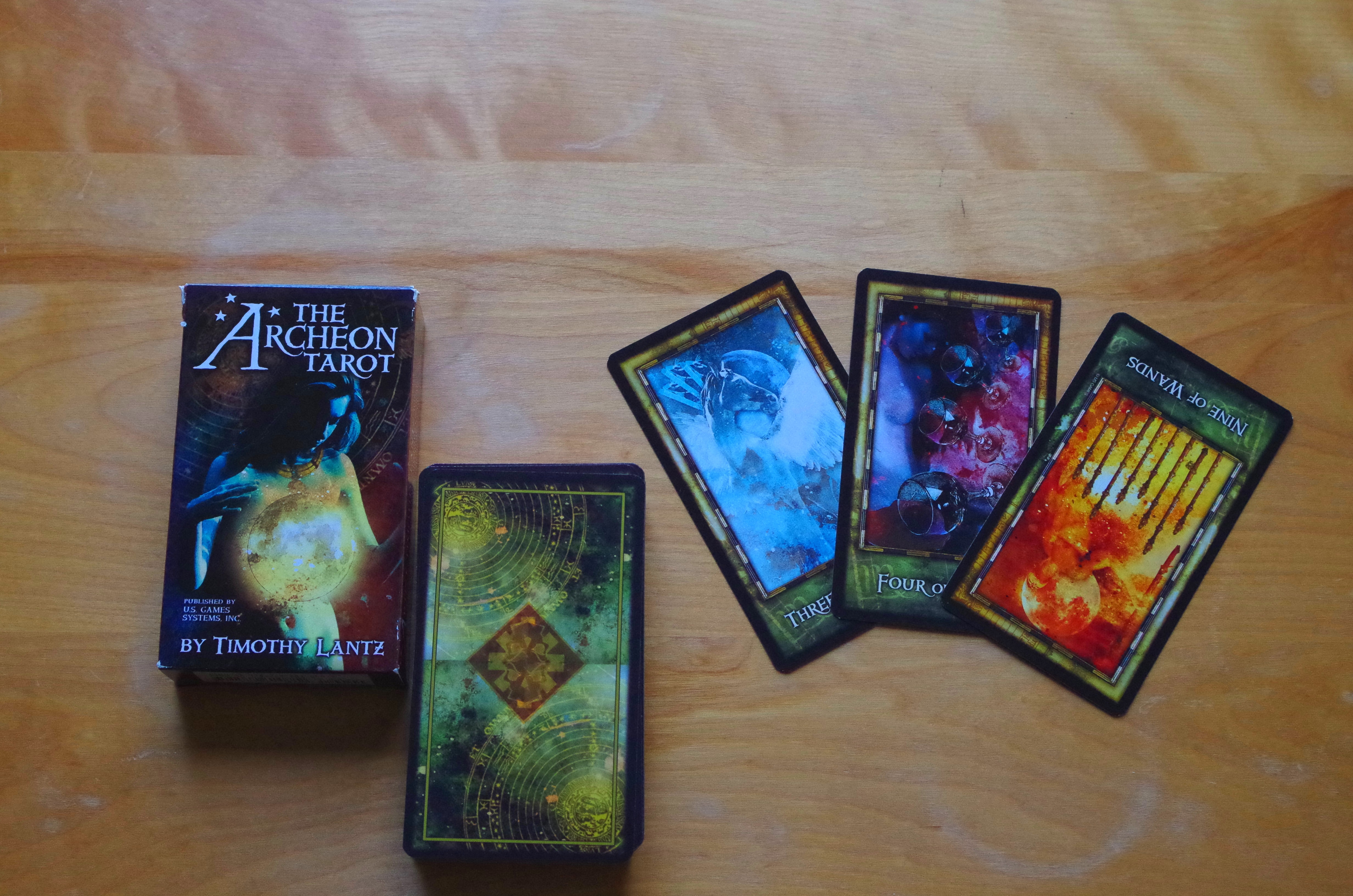
Deck: The Archeon Tarot
Publisher: US Games Systems, Inc.
Developer & Artist: Timothy Lantz
Overall Rating: 9/10

Cardstock: Easy enough to shuffle. Seems to stand up reasonably well to moderate use – several of the cards have nicked borders, but none of them are separating yet, though I’ve been using it pretty frequently in the past six months. The tuck box is deteriorating, though, since I keep throwing it directly in my purse.
Artwork: Back allows for reversals. Black borders and greenish frame. Card names on lower frame. Most artwork depicts human figures, animals, and pips, sometimes in ways that are reminiscent of the traditional Rider-Waite-Smith images. Artwork is digital mixed media heavily based on model photography, and there’s a fair amount of artistic nudity but nothing I would consider pornographic. Facial expressions of the models are fairly evocative and match card meanings. Overall the artwork feel is somewhat dark and emotionally intense.
LWB: Pretty helpful, especially considering this is not a strict RWS deck. Meanings are pretty consistent with traditional themes, though some of the gender symbolism (which I ignore anyway) is different. Each Major entry begins with a short quotation, and a few explanatory paragraphs before a list of keywords for both uprights and reversals. Each Minor entry begins with a short line that almost feels like poetry, to complement the artwork, and then gives keywords for both uprights and reversals. For example, the 9 Wands above begins with “One by one, they aligned themselves with the stars.” It gives one spread example: Celtic Cross. Does not give much information on how to read tarot.
Likes: The artwork was a bit intense for me at first but it grew on me, and it fits an empty space in my collection. I’ve been using it as my go-to deck for talking to Na Morrigna. I like how evocative the images are, because my primary mode of reading is very intuitive.
Dislikes: I usually buy tarot decks based on whether or not I fall in love with The Star, which is my personal significator… and I don’t love this one. I also don’t like how the reversal keywords are basically just the opposites of the upright keywords. There is so much more to reversals than that, and honestly that space could have been better used by providing more fleshed out meanings to the upright cards, since they usually have no more than about a half dozen words or phrases. Also, the LWB has quite a few typos and formatting errors.
Overall Recommendation:
This is a solid deck for someone who’s familiar with tarot already, and likes reading intuitively based on artwork. That said, the artwork definitely isn’t for everyone, and the nudity on the cards might make it difficult to use for in person readings in some public places. It’s available for $20 on Amazon which is about average for a deck like this, by a big publisher. Full disclosure, I have done a little modeling for the artist for another publication of his, but I paid for the deck myself. He’s fairly local, and I got him to sign the title card at FaerieCon East a few years back. In general I recommend this deck if the artwork speaks to you.
