Website currently under renovation - thanks for your patience! Dismiss

Open post

Oracle Deck Review: Faery Forest Oracle

Deck: Faery Forest Oracle

Publisher: Blue Angel

Writer: Lucy Cavendish

Artist: Maxine Gadd

Overall Rating: 5/10

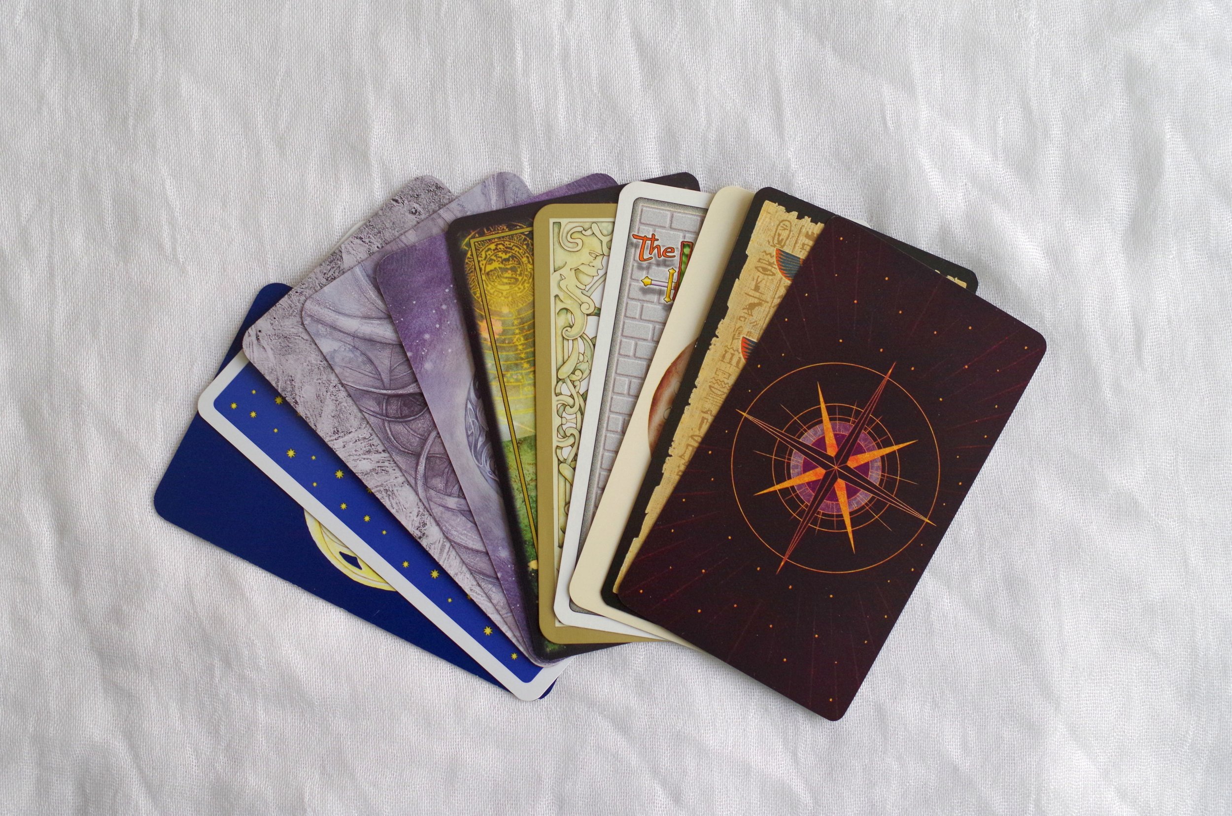
Cardstock: The cardstock is pretty standard — they'd be easier to riffle shuffle if they weren't quite so large! But they're a bit difficult for me to hold, measuring about 5.5″ tall and 3.75″ wide (or 14cm x 9.5 cm). I end up using a variety of shuffling methods to get them well-mixed. The deck box is a two part hard case, which so far is holding up well.

Artwork: The artwork is a variety of media — according to the booklet, the artist works in everything from from digital to oils — but the general style of the artwork is fairly consistent, and the themes of the deck are clear. The only drawback is that some of the images are less crisp than others, probably due to differences in the original media. These cards have pretty thick borders — thick enough that I'd be tempted to trim them down. And in addition to the card titles at the bottom, each card has three keywords.

Book: The booklet starts off with a few pages about the imagined Faery Forest, and how to use the cards. There are four provided spreads, including a past/present/future, a Celtic Cross, and two spreads for this specific deck. There is a small black-and-white image for each card before the meaning, and the meanings are not too sparing — most have three medium-sized paragraphs.

Likes: I like the general vibe of the deck, as I am more partial to fae being depicted in less twee ways. Also it does read fairly consistently well; there's a good mix of words used for the titles. The booklet meanings are all pretty clear, and give a good overview of each card.

Dislikes: I really do not vibe with the cards for Freyr and Frigga in this (there's no Freya or Odin), so... I pulled them out. I'm also not a huge fan of the differences in art media and especially in clarity — it feels a little bit like the artist went and pulled a bunch of their old work and put it all in one large binder, and didn't try very hard to make sure they all felt cohesive. And this deck, as with most fairy-themed decks, does have mainly depictions of conventionally pretty, thin, young-looking, light-skinned, feminine fairies (I would say "white" but even the ones that are too silver or blue or green to be human have very light skintones). There's not much diversity in body type and hardly any masculine fairies.

Overall Recommendation

If you like the dark faery aesthetic it's pretty solid as an additional deck, but I don't think I'd recommend it as a first deck or an only deck. I think I would love it more if the artwork was more consistent, but even as it is, it's a very visually appealing deck, and with the titles and keywords on the cards, it lends itself pretty well to off-the-cuff readings. As I said in my review for the Wild Wisdom of the Faery Oracle, that one and this work pretty well together, with that one offering a little more sugar-coating if that's what the situation calls for. But ultimately I think this is another deck I wouldn't bother replacing if it gets damaged or goes missing.

Open post

Lenormand Deck Review: Queer Lenormand

Deck: Queer Lenormand

Publisher: Self published

Writer & Artist: Mariana Andrade

Overall Rating: 10/10

Cardstock: The cardstock is on the thin end of standard, more like cards that come with a board game than something like a pack of poker cards. But they’re easy to riffle shuffle.

Artwork: The artwork is a digital illustration style with a low amount of shading that reminds me of old scum pop art. It’s vibrantly colorful, as one would hope! There are a rainbow of background options, each chosen to contrast the illustration.

People Cards: I’m adding a section for this, because where this deck really shines is the wealth of options available for Person cards. There are only two Child cards (one with light skin and one with dark skin), but there are five each of “Woman”, “Man”, and “Person” cards, with a variety of skin tones and presentations, as well as two “Drag Queen” and two “Drag King” cards, each with light skin or dark skin options.

Book: The book has a decent sized paragraph and a list of keywords for each card. The “Man” and “Woman” cards also invite the reader to think outside the box about femininity and masculinity, while the “Person” card explicitly refers to people outside the gender binary. The paragraph for the two drag cards talks about our ability to explore binary energy, no matter what our actual gender is, if we have one. The booklet also gives a couple of brief spread examples. I do wish it gave a little more info on the Lenormand system itself, though.

Likes: I love the art and I love the diversity of the people cards, it does make it a lot easier to read for more people, and for my clients to see themselves reflected in the cards

Dislikes: I do wish there was a third option of skin tone. The five options in the “Man”, “Woman”, and “Person” cards include two people with light skin, one person with light skin who seems East Asian, and two people with dark skin, but no medium tone. Still, it’s way more diversity than usual!

Overall Recommendation

This is the deck I most commonly bring with for reading in person. The artwork is colorful and engaging, and people enjoy selecting a card for themselves and their partner or whomever they’re asking about. The box is also two parts and pretty sturdy, so it travels well. I personally love buying indie decks, especially from queer creatives, and I’d recommend this deck to anyone – with the single caveat that if you’re new to Lenormand you might want to pair this deck with a book on the system itself, since it does read differently than either tarot or regular oracle cards.

Open post

Lenormand Deck Review: Under the Roses

Deck: Under The Roses Lenormand
Publisher: US Games Systems, Inc
Writer & Artist: Kendra Hurteau & Katrina Hill
Overall Rating: 9/10

Cardstock: The cardstock is fairly standard, like what you’d expect from a similar pack of poker cards. Easy to riffle shuffle, neither too matte nor too slick.

Artwork: The artwork is a digital illustration style that evokes a Victorian or Gothic aesthetic. Additionally, the backgrounds have subtle text featuring the meanings of the cards. There are two versions of each person card, with light skin or dark skin, and there is no Querent or non-gendered person card, but I’ve been using the title card for the Querent.

Book: This deck has a fairly standard Little White Booklet, with a list of keywords for each card, and descriptions of basic spreads, as well as a spread developed specifically for this deck. The booklet also explains how Lenormand is read in combinations, unlike tarot.

Likes: I like the artwork and aesthetic, and I feel like it’s neither too simple nor too busy. The instructions are fairly good, too – this was my first Lenormand deck (years ago!) and the LWB was definitely helpful in getting my head wrapped around this system.

Dislikes: I wish there were more people cards. That’s pretty much the only drawback, in my opinion.

Overall Recommendation

This is my go-to Lenormand deck most of the time, and at this point the box is starting to disintegrate because of that! I do sometimes have to add people cards from another deck (particularly the Queer Lenormand which has amazing diversity), but it reads well, and I think the imagery of the non-people cards is pretty evocative. It worked for me as a first Lenormand deck, but it might not be the best introduction for someone who’s entirely new to cartomancy.

Open post

Lenormand Deck Review: Bluebird

Deck: The Bluebird Lenormand
Publisher: US Games Systems, Inc
Writer: Stuart R. Kaplan
Artist: Various historical artists, artwork is all in the creative commons
Overall Rating: 5/10

Cardstock: The cardstock is fairly standard, like what you’d expect from a similar pack of poker cards. Easy to riffle shuffle, neither too matte nor too slick.

Artwork: The artwork is in an illustration style with muted colors to mimic the paintings that are paired with each person card. All the paintings are from the 1700s I believe, and they’re all portraits of white people as one might expect, but the Lady and Gentleman cards do have two options, one older and one younger. One interesting thing about these cards is that they also each feature a little snippet of poetry, which hints at the meaning of the card.

Book: This deck has a fairly standard Little White Booklet, with a list of keywords for each card, and a few descriptions of spreads. The booklet also includes a short biography of Mademoiselle Lenormand, who created this system in the late 1700s.

Likes: I like the little bits of poetry and the illustrations are well done, but this deck doesn’t really draw me in – I don’t find myself reaching for it very often.

Dislikes: I’m not sure the portraits really add much beyond a certain historical flair. Between the portraits and in-set cards and the poetry, half the card face is taken up with things other than the illustrations, and to me it looks a bit cluttered and makes it a little harder to focus on the reading.

Overall Recommendation

While this deck doesn’t particularly speak to me, I imagine for people who like in-set cards or who are coming from a cartomancy system that uses poker cards, this would be an excellent deck to learn on. I was already familiar with the system before I bought it, and I bought it more as a historical curiosity (as it’s a reprinted vintage deck). I do tend to use this one as my second deck when I’m using a spread with Houses, though, because of the clear card titles I can let peek out from under the primary deck.

Open post

Tarot Deck Review: Shadowscapes

Deck: Shadowscapes Tarot
Artist: Stephanie Pui-Mun Law
Writer: Barbara Moore
Publisher: Llewellyn
Overall Rating: 9/10

Cardstock: These are standard tarot size and shape, with Llewellyn’s standard semi-gloss texture, and they riffle shuffle pretty well. The borders are a pretty silver, but not fully metallic, and this doesn’t have the glittery edges that have become all the rage for indie decks.

Artwork: The artwork is the main selling point for this deck: Stephanie Pui-Mun Law’s watercolors are fantastical, exquisitely detailed, and very expressive. There are threads of color schemes and imagery themes going through the minor suits in this deck, but nothing is very monochrome or repetitive. The artwork is excellent for intuitive reading, and that’s the main reason it was on my list – I got this deck as a gift several years back!

Book: The edition I have of this deck did not come with a tuck box or a booklet, but just came with a full sized book. The book spends more time describing the scene than describing the keywords, but the meaning can be gleaned from those descriptions in an intuitive way as well, and I always enjoy having insight into the artist’s symbolism!

Likes: I really like both the artwork and the book, and I even actually like the borders – though I know a couple of people who’ve cut them off of their own decks! This is a really solid deck that I ought to reach for more, and I’m glad I finally got it into my latest shop update. [Check it out here!]

Dislikes: The only thing I dislike about this deck is that I wish it had come with a different kind of box – some of the Llewellyn decks with full sized books come in magnetic boxes now and I tend to like those, but I think I sort of forget about this deck when it’s in a bag and not with the rest of my tarot collection! Maybe I’ll have to get a bag with some of Stephanie Pui-Mun Law’s art on it from somewhere!

Overall Recommendation

I would recommend this deck for intuitive readers, and basically any intermediate reader who feels drawn to it. Since the book is somewhat minimal on traditional card meanings and the art doesn’t reflect the Rider-Waite-Smith, new readers may want to get a reference book to use along with it until they get their bearings.

Open post

Love & Relationship Divination Spread for Multiple Partners

I’ve been considering making a listing for this type of spread for a while, because while I can certainly design a custom reading with any number of cards for any situation, I think there’s just a lack of non-monogamous relationship spreads in the community in general and I thought it might be helpful to outline the one I use. This one can be used equally well for a triad or a V where the two partners have a platonic relationship with each other – or you could leave out cards 9 and 10 if you don’t want to explore that. This can also be expanded and adapted to be used for a lot of other relationship maps – with one card for each person represented, and two cards for each relationship that’s explored. Laying out the cards in this kind of manner might get difficult with more than three people, though, so I would suggest drawing a diagram and labeling it with the card numbers and then just laying the cards out in rows to look at them!

  1. The State of the Polycule: How are the relationships functioning together as a whole?

  2. You: your needs, wants, and concerns about the relationships

  3. Partner #1: their needs, wants, and concerns about the relationships

  4. Partner #2: their needs, wants, and concerns about the relationships

  5. The relationship between you and P#1: places you can improve

  6. The relationship between you and P#1: things that are going well

  7. The relationship between you and P#2: places you can improve

  8. The relationship between you and P#2: things that are going well

  9. The relationship between P#1 & P#2: ways you can help what isn’t working

  10. The relationship between P#1 & P#2: ways you can support what is going well

If you do this spread yourself, I’d love to hear how well it worked for you! And feel free to share this post with other readers!

This spread is available in my shop now, as well, and is currently on sale – 40% off through the end of the month!

Open post

Tarot Deck Review: Oriens Tarot/Oriens Animal Tarot

Deck: The Oriens Tarot/ The Oriens Animal Tarot
Publisher: Ambisun / Rockpool
Artist: Ambisun
Writer: T.D. Cloud
Overall Rating: 9/10

Note: I have the first edition of this deck, through Kickstarter, and I am not sure what all has changed in the second edition through Rockpool, so while this review may accurately reflect the new edition, there are likely to be small changes, especially to the box and the cardstock.

Cardstock: The cardstock on the first edition is somewhat plastified or very laminated, and although the cards aren’t too shiny or slick, they flex and shuffle very well. I’m a huge fan!

Artwork: The artwork is really bright and clear despite the dark background color, and all the animals (and insects are depicted recognizably and detailed, without being either cartoonish or hyperrealistic. I wasn’t sure how I felt about the neon colors at first, but I liked the art style and the colors really grew on me. I will say though, this may not be the deck for people squeamish about insects or spiders. It says “animals” but there are insects and sea slugs and the like, too. I think each animal/insect image does a pretty good job of illustrating the card meaning, too, without being based too heavily on the Rider-Waite-Smith imagery.

Book: With the Kickstarter first edition, I got a full-length ebook. I have no idea if the new deck has a full book, a Little White Book, or an option for both, so keep that in mind. The ebook I have has keywords for both uprights and reversals, a short paragraph about the animal chosen and the imagery, and then a paragraph each for upright and reversed divination meanings. As an experienced reader I don’t refer to the paragraphs about the meaning much, but I do really like the paragraph about what animal was chosen, and why.

Likes: I love the artwork, and how well these shuffle. I think this deck lends itself well to intuitive reading, as the imagery is so expressive.

Dislikes: The neon-on-dark took a little while to get used to, but that’s not really a “dislike”. I don’t really have any dislikes for this deck, just the warning that there are quite a few insects and also a spider, in case that’s not your thing.

Overall Recommendation

This is one of the most popular decks in my shop. Clients seem to really connect with the artwork and the meanings, and the artwork is very beautiful and striking. It also avoids many of the depiction problems that decks featuring mainly human figures have: namely, a lack of inclusion of different skintones, genders, body types, ability levels, ages, etc. My only hesitation in recommending this deck to beginners and seasoned practitioners alike, is that I am not sure what the cardstock is like for the second edition!

Open post

Tarot Spread: Turning over a New Leaf

This is a cartomancy spread I designed several years ago, as an alternative to the “12 cards for 12 months” types of New Year’s spreads, but it can be used at any point in your life when you feel the need to turn over a new leaf and make a change! The idea is there’s one side of the leaf going out of your life, and a new side coming in, and I organized the cards to resemble two leaves, flipped in opposite directions. I offer this spread (and a smaller version with 7 cards) in my shop, and they’re both currently on sale! I’d also love to hear how this spread works out for you, if you try it yourself!

Card Positions:

  1. Something you’re ready to let go of

  2. Something you should let go of

  3. Something you want to let go of

  4. An external way to make necessary changes in your life

  5. An internal way to make necessary changes in your life

  6. An obstacle in your path

  7. Something you’re ready to accept into your life

  8. Something you should accept into your life

  9. Something you want to accept into your life

  10. An external way to make necessary changes in your life

  11. An internal way to make necessary changes in your life

  12. An obstacle in your path

Open post

Tarot Deck Review: Emerging from Darkness

Deck: Emerging From Darkness
Writer & Artist: Robin L. Cole
Publisher: Self-Published
Overall Rating: 6/10

Cardstock: These cards are standard tarot sized with a semi-matte texture, and they riffle shuffle pretty well. The edges are gilded in a silver glitter but after the first few uses they didn’t seem to really shed flakes. They riffle shuffle pretty well, but the edges aren’t smooth, which means I have to take a little more care than I might normally, when shuffling. The print job is what you’d expect from a high-quality deck.

Artwork: The artwork is mostly black and white, but there are colored labels and some muted color throughout. The sketch-like style features a lot of crosshatching for shading and depth, and it’s a little strange to me to be looking at that kind of artwork up close, since it is a little busy. I think the art style (and thus the deck) looks better from a distance, but that might just be a personal preference. I think the sketch-like style does lend itself well to the central metaphor of the deck, the interplay of light and dark, even if I personally find it a little difficult to read this deck intuitively based on the artwork. Besides my difficulties with the crosshatching though, I do find the artwork to be very emotionally evocative.

Book: The included booklet is more of a pamphlet – approximately three words per card – but the deck did come with the option of a full sized book or an ebook: “Emerging from Darkness: Using Tarot for Personal Shadow Work”. I bought the physical copy of the book, and I’ve found it very useful. There are a few chapters at the beginning that serve as a decent introduction to shadow work just in general, and the included tarot exercises have proved very fruitful for me and others.

Likes: I really like that this deck and book are meant to work together, to guide the user in one of the most important kinds of growth, which is also one of the most undervalued and neglected! That is really what drew me to this deck, the idea that it could really help me and my clients when we’re struggling with our own personal shadows.

Dislikes: It’s really a minor thing overall, but I find the coarse size of the crosshatching in the artwork to be a little distracting.

Overall Recommendation

I think this deck has a space in my collection more for the book than for the deck itself. They’re a team that works well together, but I think if they were separate and not so intrinsically linked, I might just have bought the book and skipped the deck. As it is, though, I do like them as a team. I just don’t find myself reaching for this deck when I have other types of questions.

Open post

Four Ways to Read Tarot Reversals

A couple of months back, I was doing an in person reading for someone who said they were somewhat new to their own tarot practice, and as I walked them through what I was seeing in the cards we’d laid out, I made a note to also explain some of the “Why”, and that turned into a short explanation of the four ways I usually read reversals, which I thought I’d share here!  And: major shout-out to Lynda Hardy, who gave a presentation on reversals about a decade ago, which really helped me organize my thoughts about them and understand them better, right as I was beginning to branch out and do readings for acquaintances!

I don’t always use reversals – some decks I never let the cards turn upside-down, sometimes I’ll turn the whole deck back upright before drawing, and sometimes I’ll just tell the deck not to bother because I’m going to read them all upright.  When I do use them, though, the first thing I do (as an intuitive reader) is try to feel what kind of reversal it is, by sorting them into one of three broad categories: Delay, Internalized, Shadowed, and Opposite. 

Delay

This kind of reversal means that the standard meaning of the card is still going to happen, but it’s going to take longer than it normally would to come about.  This delay can mean that some cards that are often understood to mean something happening soon or quickly can unfold over a longer period, like Death or the Tower.   In a “past” position in a spread, a delay reversal can either mean a lengthening of the past into the present, or a very long-term past pattern stretching into the more distant past.  This is probably the type of reversal that changes the meaning the least.

Shadowed

Shadowed reversals change the meaning only a little bit more than the delayed type.  For the shadowed meaning, the basic meaning doesn’t really change, but any negatives are emphasized and put front and center, and any positives are downplayed.  Even overtly positive cards like The Sun can be dimmed by a shadowed reversal, becoming a sign of “probable success” instead of a sure thing!  A lot of tarot cards are pretty neutral, but have aspects that can become negative when taken to an extreme, and that’s when I most commonly see shadowed reversals in a reading.

Internalized

An internalized reversal most often means that the conflict in the card is something the querent is feeling internally.  For example, the Five of Wands is usually understood to be about conflict, disagreement, and competition – all external, normally.  If internalized, that card could instead mean that someone is in disagreement with themselves, or that they’re feeling stress from what they perceive as a competition, though the other person doesn’t have a clue what’s going on.  This same kind of internalization can also mean that the actions associated with the swords and the material things associated with the coins/pentacles can become more about the querent’s inner world, their mental states and emotions.

Opposite

Opposite meaning reversals are probably the best known, and they are the type most people are familiar with, and the type that you’ll most commonly find described in the booklet that comes with a deck.  Positives become negatives, endings become beginnings, victories become losses, solutions become obstacles.  In booklets that don’t have keywords for reversals, it can sometimes be a little challenging to come up with opposites, but its important to remember that sometimes the opposite of a neutral thing is just a very different neutral thing.  For example, The Heirophant represents spiritual tradition and religious authority when upright, and the opposites of those two things might be developing new spiritual practices, and a neophyte.  None of those things are inherently negative, but they’re opposites of each other. (And before anyone gets on my case about “religious authority” being negative, yeah a lot of people who claim that title are fairly problematic, but it’s not inherently negative as a concept.  People who actually know the lore and the language/culture well enough to explain it to others are religious authorities as well!  It’s the demand for unquestioning followers that is toxic, and that doesn’t have to be a feature of our pagan religions.)

Hopefully that helps some of you get deeper meaning out of your readings!


Reminder: All of my 12-card or 12-rune spreads, and all of the year-overview and life-overview spreads are on sale in my web shop for approx. 20% off, now through the end of January!  No coupon necessary – the sale price is just listed in the shop.  (And look for a flash sale on all divination at the end of December!)  Make sure you’re shopping on my website, though – I have an Etsy shop as well, but the sales won’t be active there.

Posts navigation

1 2 3 4 5