Deck: Faery Forest Oracle
Publisher: Blue Angel
Writer: Lucy Cavendish
Artist: Maxine Gadd
Overall Rating: 5/10
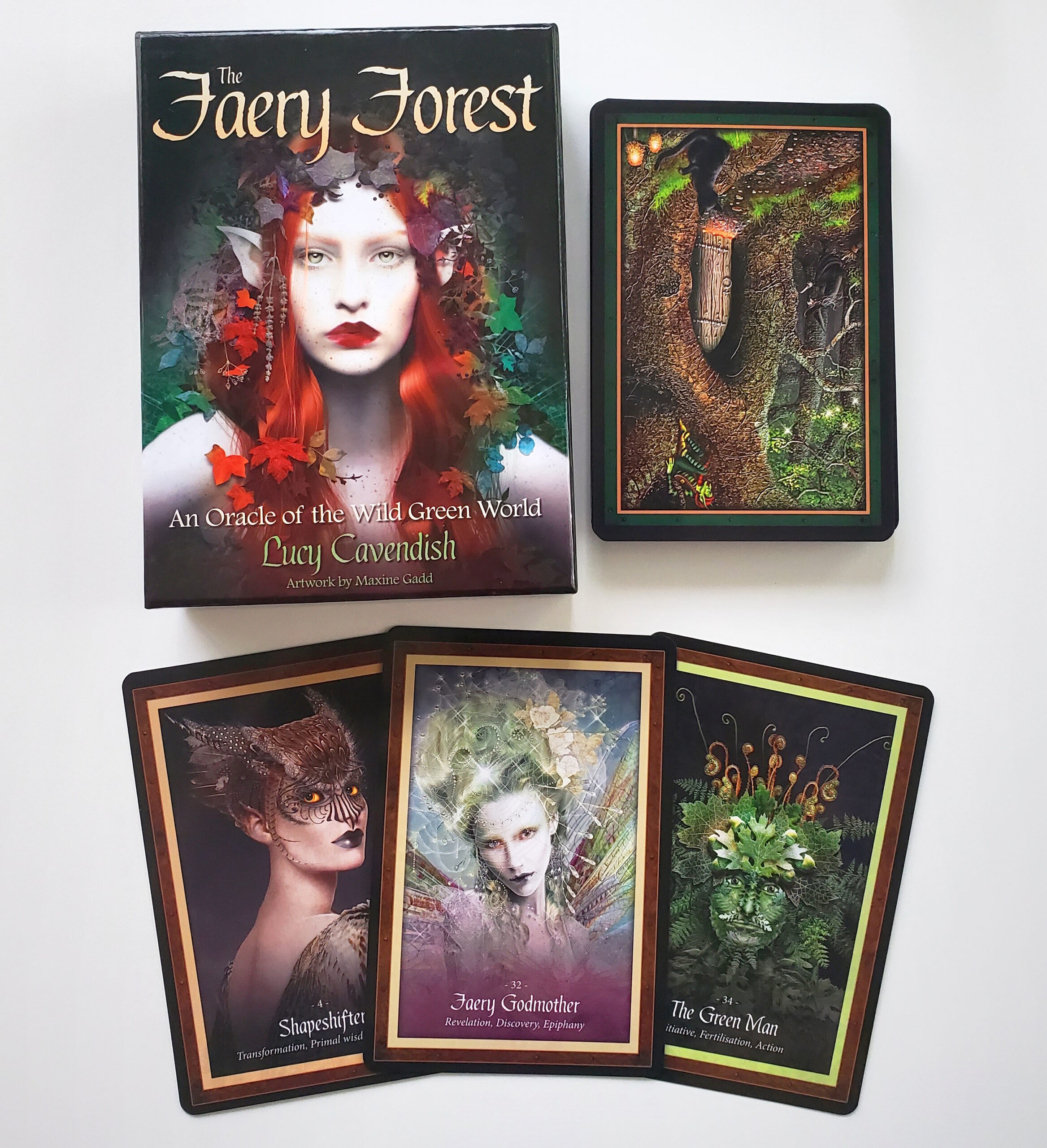
Cardstock: The cardstock is pretty standard — they'd be easier to riffle shuffle if they weren't quite so large! But they're a bit difficult for me to hold, measuring about 5.5″ tall and 3.75″ wide (or 14cm x 9.5 cm). I end up using a variety of shuffling methods to get them well-mixed. The deck box is a two part hard case, which so far is holding up well.
Artwork: The artwork is a variety of media — according to the booklet, the artist works in everything from from digital to oils — but the general style of the artwork is fairly consistent, and the themes of the deck are clear. The only drawback is that some of the images are less crisp than others, probably due to differences in the original media. These cards have pretty thick borders — thick enough that I'd be tempted to trim them down. And in addition to the card titles at the bottom, each card has three keywords.
Book: The booklet starts off with a few pages about the imagined Faery Forest, and how to use the cards. There are four provided spreads, including a past/present/future, a Celtic Cross, and two spreads for this specific deck. There is a small black-and-white image for each card before the meaning, and the meanings are not too sparing — most have three medium-sized paragraphs.
Likes: I like the general vibe of the deck, as I am more partial to fae being depicted in less twee ways. Also it does read fairly consistently well; there's a good mix of words used for the titles. The booklet meanings are all pretty clear, and give a good overview of each card.
Dislikes: I really do not vibe with the cards for Freyr and Frigga in this (there's no Freya or Odin), so... I pulled them out. I'm also not a huge fan of the differences in art media and especially in clarity — it feels a little bit like the artist went and pulled a bunch of their old work and put it all in one large binder, and didn't try very hard to make sure they all felt cohesive. And this deck, as with most fairy-themed decks, does have mainly depictions of conventionally pretty, thin, young-looking, light-skinned, feminine fairies (I would say "white" but even the ones that are too silver or blue or green to be human have very light skintones). There's not much diversity in body type and hardly any masculine fairies.
Overall Recommendation
If you like the dark faery aesthetic it's pretty solid as an additional deck, but I don't think I'd recommend it as a first deck or an only deck. I think I would love it more if the artwork was more consistent, but even as it is, it's a very visually appealing deck, and with the titles and keywords on the cards, it lends itself pretty well to off-the-cuff readings. As I said in my review for the Wild Wisdom of the Faery Oracle, that one and this work pretty well together, with that one offering a little more sugar-coating if that's what the situation calls for. But ultimately I think this is another deck I wouldn't bother replacing if it gets damaged or goes missing.
