Website currently under renovation - thanks for your patience! Dismiss

Open post

Oracle Deck Review: Faery Forest Oracle

Deck: Faery Forest Oracle

Publisher: Blue Angel

Writer: Lucy Cavendish

Artist: Maxine Gadd

Overall Rating: 5/10

Cardstock: The cardstock is pretty standard — they'd be easier to riffle shuffle if they weren't quite so large! But they're a bit difficult for me to hold, measuring about 5.5″ tall and 3.75″ wide (or 14cm x 9.5 cm). I end up using a variety of shuffling methods to get them well-mixed. The deck box is a two part hard case, which so far is holding up well.

Artwork: The artwork is a variety of media — according to the booklet, the artist works in everything from from digital to oils — but the general style of the artwork is fairly consistent, and the themes of the deck are clear. The only drawback is that some of the images are less crisp than others, probably due to differences in the original media. These cards have pretty thick borders — thick enough that I'd be tempted to trim them down. And in addition to the card titles at the bottom, each card has three keywords.

Book: The booklet starts off with a few pages about the imagined Faery Forest, and how to use the cards. There are four provided spreads, including a past/present/future, a Celtic Cross, and two spreads for this specific deck. There is a small black-and-white image for each card before the meaning, and the meanings are not too sparing — most have three medium-sized paragraphs.

Likes: I like the general vibe of the deck, as I am more partial to fae being depicted in less twee ways. Also it does read fairly consistently well; there's a good mix of words used for the titles. The booklet meanings are all pretty clear, and give a good overview of each card.

Dislikes: I really do not vibe with the cards for Freyr and Frigga in this (there's no Freya or Odin), so... I pulled them out. I'm also not a huge fan of the differences in art media and especially in clarity — it feels a little bit like the artist went and pulled a bunch of their old work and put it all in one large binder, and didn't try very hard to make sure they all felt cohesive. And this deck, as with most fairy-themed decks, does have mainly depictions of conventionally pretty, thin, young-looking, light-skinned, feminine fairies (I would say "white" but even the ones that are too silver or blue or green to be human have very light skintones). There's not much diversity in body type and hardly any masculine fairies.

Overall Recommendation

If you like the dark faery aesthetic it's pretty solid as an additional deck, but I don't think I'd recommend it as a first deck or an only deck. I think I would love it more if the artwork was more consistent, but even as it is, it's a very visually appealing deck, and with the titles and keywords on the cards, it lends itself pretty well to off-the-cuff readings. As I said in my review for the Wild Wisdom of the Faery Oracle, that one and this work pretty well together, with that one offering a little more sugar-coating if that's what the situation calls for. But ultimately I think this is another deck I wouldn't bother replacing if it gets damaged or goes missing.

Open post

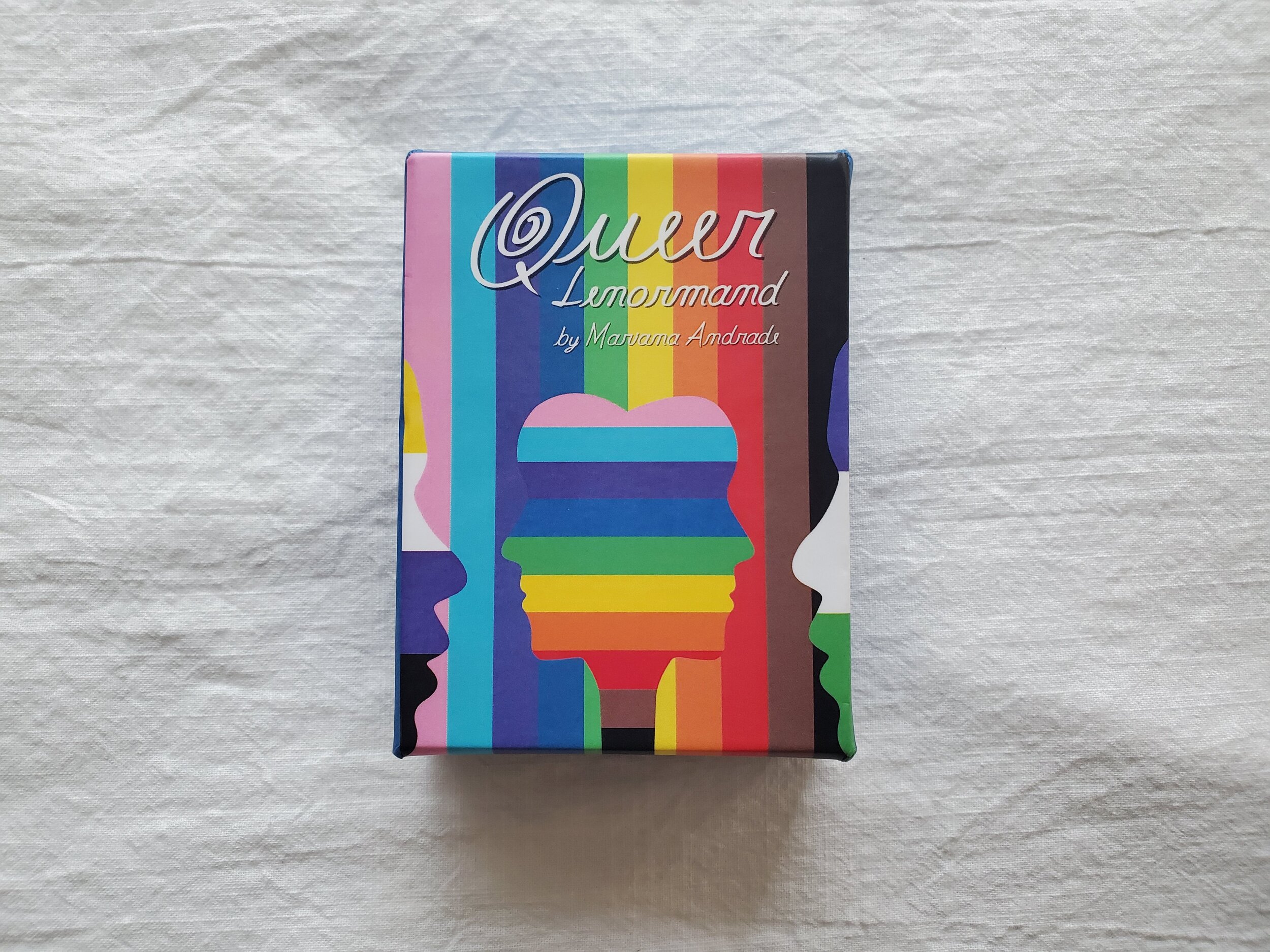
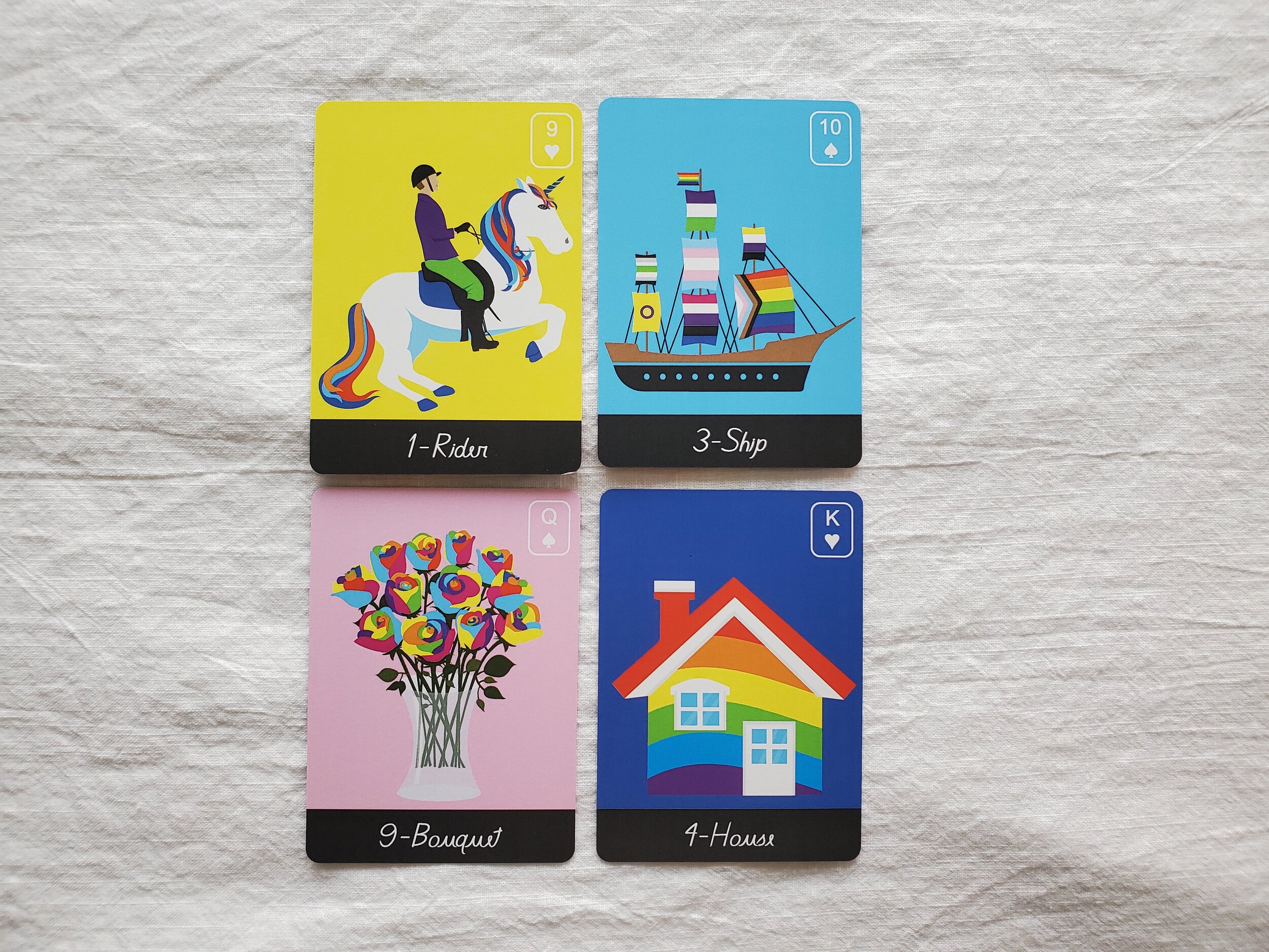
Lenormand Deck Review: Queer Lenormand

Deck: Queer Lenormand

Publisher: Self published

Writer & Artist: Mariana Andrade

Overall Rating: 10/10

Cardstock: The cardstock is on the thin end of standard, more like cards that come with a board game than something like a pack of poker cards. But they’re easy to riffle shuffle.

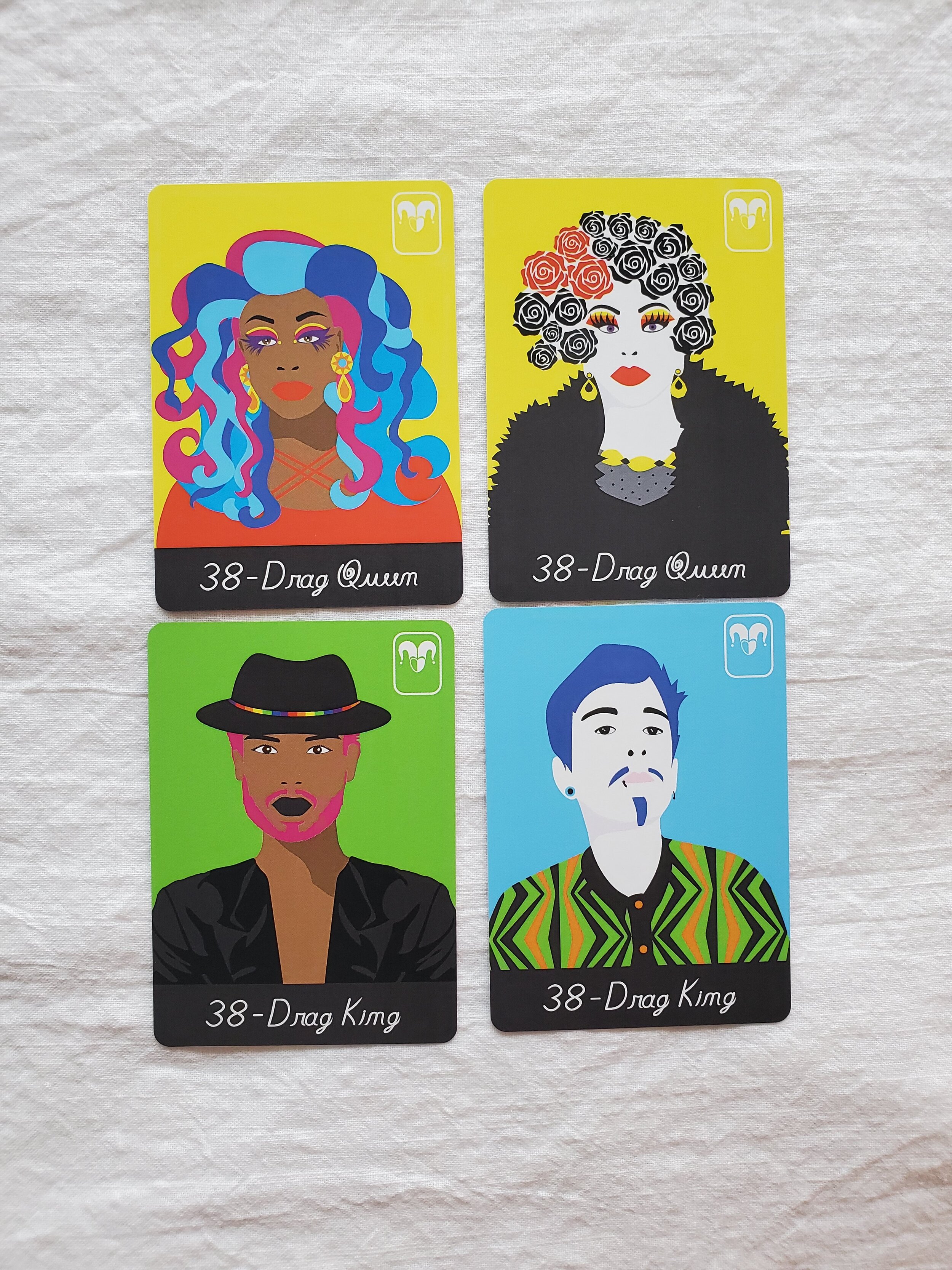
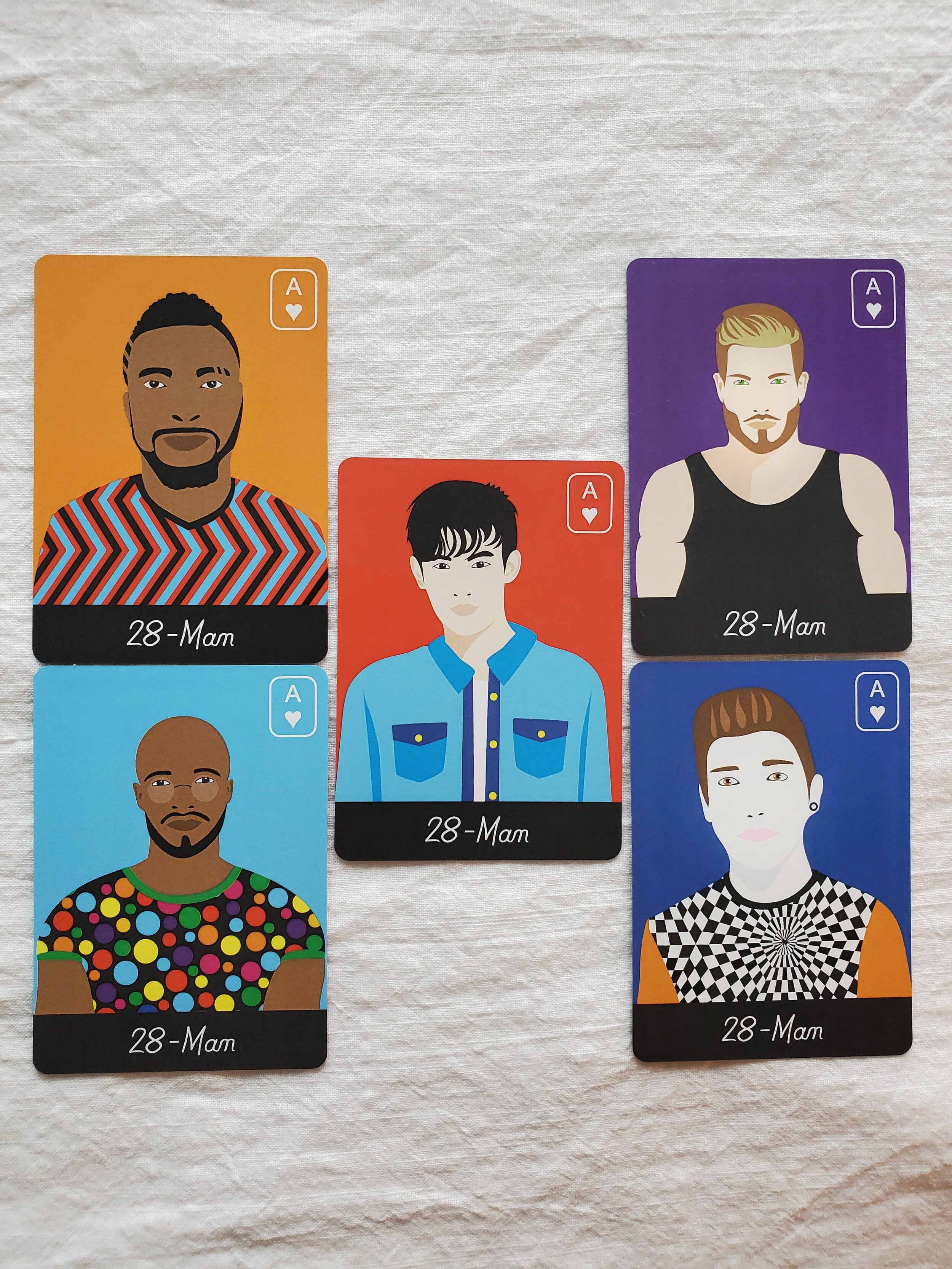
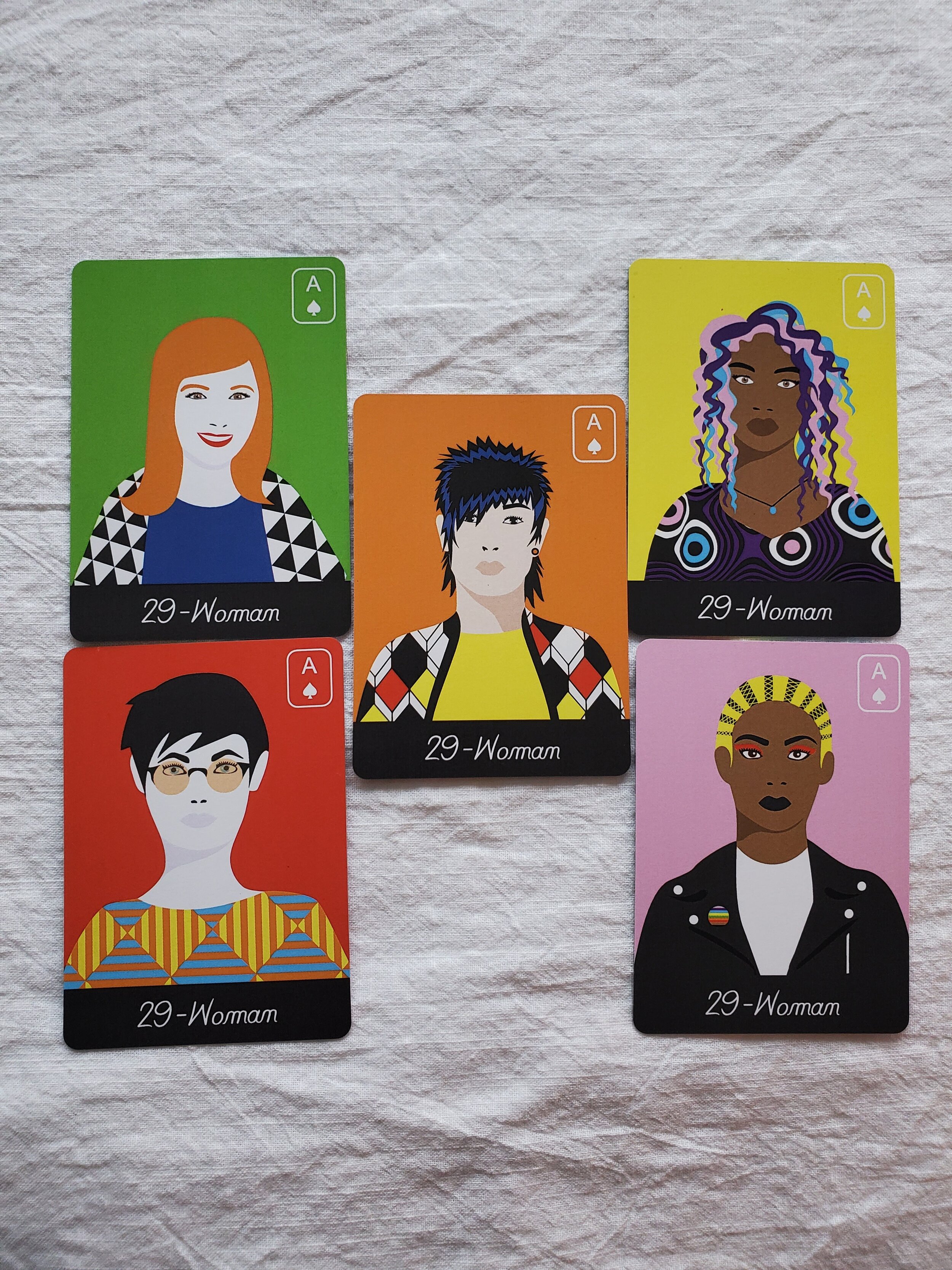
Artwork: The artwork is a digital illustration style with a low amount of shading that reminds me of old scum pop art. It’s vibrantly colorful, as one would hope! There are a rainbow of background options, each chosen to contrast the illustration.

People Cards: I’m adding a section for this, because where this deck really shines is the wealth of options available for Person cards. There are only two Child cards (one with light skin and one with dark skin), but there are five each of “Woman”, “Man”, and “Person” cards, with a variety of skin tones and presentations, as well as two “Drag Queen” and two “Drag King” cards, each with light skin or dark skin options.

Book: The book has a decent sized paragraph and a list of keywords for each card. The “Man” and “Woman” cards also invite the reader to think outside the box about femininity and masculinity, while the “Person” card explicitly refers to people outside the gender binary. The paragraph for the two drag cards talks about our ability to explore binary energy, no matter what our actual gender is, if we have one. The booklet also gives a couple of brief spread examples. I do wish it gave a little more info on the Lenormand system itself, though.

Likes: I love the art and I love the diversity of the people cards, it does make it a lot easier to read for more people, and for my clients to see themselves reflected in the cards

Dislikes: I do wish there was a third option of skin tone. The five options in the “Man”, “Woman”, and “Person” cards include two people with light skin, one person with light skin who seems East Asian, and two people with dark skin, but no medium tone. Still, it’s way more diversity than usual!

Overall Recommendation

This is the deck I most commonly bring with for reading in person. The artwork is colorful and engaging, and people enjoy selecting a card for themselves and their partner or whomever they’re asking about. The box is also two parts and pretty sturdy, so it travels well. I personally love buying indie decks, especially from queer creatives, and I’d recommend this deck to anyone – with the single caveat that if you’re new to Lenormand you might want to pair this deck with a book on the system itself, since it does read differently than either tarot or regular oracle cards.

Open post

Lenormand Deck Review: Under the Roses

Deck: Under The Roses Lenormand
Publisher: US Games Systems, Inc
Writer & Artist: Kendra Hurteau & Katrina Hill
Overall Rating: 9/10

Cardstock: The cardstock is fairly standard, like what you’d expect from a similar pack of poker cards. Easy to riffle shuffle, neither too matte nor too slick.

Artwork: The artwork is a digital illustration style that evokes a Victorian or Gothic aesthetic. Additionally, the backgrounds have subtle text featuring the meanings of the cards. There are two versions of each person card, with light skin or dark skin, and there is no Querent or non-gendered person card, but I’ve been using the title card for the Querent.

Book: This deck has a fairly standard Little White Booklet, with a list of keywords for each card, and descriptions of basic spreads, as well as a spread developed specifically for this deck. The booklet also explains how Lenormand is read in combinations, unlike tarot.

Likes: I like the artwork and aesthetic, and I feel like it’s neither too simple nor too busy. The instructions are fairly good, too – this was my first Lenormand deck (years ago!) and the LWB was definitely helpful in getting my head wrapped around this system.

Dislikes: I wish there were more people cards. That’s pretty much the only drawback, in my opinion.

Overall Recommendation

This is my go-to Lenormand deck most of the time, and at this point the box is starting to disintegrate because of that! I do sometimes have to add people cards from another deck (particularly the Queer Lenormand which has amazing diversity), but it reads well, and I think the imagery of the non-people cards is pretty evocative. It worked for me as a first Lenormand deck, but it might not be the best introduction for someone who’s entirely new to cartomancy.

Open post

Lenormand Deck Review: Bluebird

Deck: The Bluebird Lenormand
Publisher: US Games Systems, Inc
Writer: Stuart R. Kaplan
Artist: Various historical artists, artwork is all in the creative commons
Overall Rating: 5/10

Cardstock: The cardstock is fairly standard, like what you’d expect from a similar pack of poker cards. Easy to riffle shuffle, neither too matte nor too slick.

Artwork: The artwork is in an illustration style with muted colors to mimic the paintings that are paired with each person card. All the paintings are from the 1700s I believe, and they’re all portraits of white people as one might expect, but the Lady and Gentleman cards do have two options, one older and one younger. One interesting thing about these cards is that they also each feature a little snippet of poetry, which hints at the meaning of the card.

Book: This deck has a fairly standard Little White Booklet, with a list of keywords for each card, and a few descriptions of spreads. The booklet also includes a short biography of Mademoiselle Lenormand, who created this system in the late 1700s.

Likes: I like the little bits of poetry and the illustrations are well done, but this deck doesn’t really draw me in – I don’t find myself reaching for it very often.

Dislikes: I’m not sure the portraits really add much beyond a certain historical flair. Between the portraits and in-set cards and the poetry, half the card face is taken up with things other than the illustrations, and to me it looks a bit cluttered and makes it a little harder to focus on the reading.

Overall Recommendation

While this deck doesn’t particularly speak to me, I imagine for people who like in-set cards or who are coming from a cartomancy system that uses poker cards, this would be an excellent deck to learn on. I was already familiar with the system before I bought it, and I bought it more as a historical curiosity (as it’s a reprinted vintage deck). I do tend to use this one as my second deck when I’m using a spread with Houses, though, because of the clear card titles I can let peek out from under the primary deck.

Open post

Tarot Deck Review: Shadowscapes

Deck: Shadowscapes Tarot
Artist: Stephanie Pui-Mun Law
Writer: Barbara Moore
Publisher: Llewellyn
Overall Rating: 9/10

Cardstock: These are standard tarot size and shape, with Llewellyn’s standard semi-gloss texture, and they riffle shuffle pretty well. The borders are a pretty silver, but not fully metallic, and this doesn’t have the glittery edges that have become all the rage for indie decks.

Artwork: The artwork is the main selling point for this deck: Stephanie Pui-Mun Law’s watercolors are fantastical, exquisitely detailed, and very expressive. There are threads of color schemes and imagery themes going through the minor suits in this deck, but nothing is very monochrome or repetitive. The artwork is excellent for intuitive reading, and that’s the main reason it was on my list – I got this deck as a gift several years back!

Book: The edition I have of this deck did not come with a tuck box or a booklet, but just came with a full sized book. The book spends more time describing the scene than describing the keywords, but the meaning can be gleaned from those descriptions in an intuitive way as well, and I always enjoy having insight into the artist’s symbolism!

Likes: I really like both the artwork and the book, and I even actually like the borders – though I know a couple of people who’ve cut them off of their own decks! This is a really solid deck that I ought to reach for more, and I’m glad I finally got it into my latest shop update. [Check it out here!]

Dislikes: The only thing I dislike about this deck is that I wish it had come with a different kind of box – some of the Llewellyn decks with full sized books come in magnetic boxes now and I tend to like those, but I think I sort of forget about this deck when it’s in a bag and not with the rest of my tarot collection! Maybe I’ll have to get a bag with some of Stephanie Pui-Mun Law’s art on it from somewhere!

Overall Recommendation

I would recommend this deck for intuitive readers, and basically any intermediate reader who feels drawn to it. Since the book is somewhat minimal on traditional card meanings and the art doesn’t reflect the Rider-Waite-Smith, new readers may want to get a reference book to use along with it until they get their bearings.

Open post

Tarot Deck Review: Oriens Tarot/Oriens Animal Tarot

Deck: The Oriens Tarot/ The Oriens Animal Tarot
Publisher: Ambisun / Rockpool
Artist: Ambisun
Writer: T.D. Cloud
Overall Rating: 9/10

Note: I have the first edition of this deck, through Kickstarter, and I am not sure what all has changed in the second edition through Rockpool, so while this review may accurately reflect the new edition, there are likely to be small changes, especially to the box and the cardstock.

Cardstock: The cardstock on the first edition is somewhat plastified or very laminated, and although the cards aren’t too shiny or slick, they flex and shuffle very well. I’m a huge fan!

Artwork: The artwork is really bright and clear despite the dark background color, and all the animals (and insects are depicted recognizably and detailed, without being either cartoonish or hyperrealistic. I wasn’t sure how I felt about the neon colors at first, but I liked the art style and the colors really grew on me. I will say though, this may not be the deck for people squeamish about insects or spiders. It says “animals” but there are insects and sea slugs and the like, too. I think each animal/insect image does a pretty good job of illustrating the card meaning, too, without being based too heavily on the Rider-Waite-Smith imagery.

Book: With the Kickstarter first edition, I got a full-length ebook. I have no idea if the new deck has a full book, a Little White Book, or an option for both, so keep that in mind. The ebook I have has keywords for both uprights and reversals, a short paragraph about the animal chosen and the imagery, and then a paragraph each for upright and reversed divination meanings. As an experienced reader I don’t refer to the paragraphs about the meaning much, but I do really like the paragraph about what animal was chosen, and why.

Likes: I love the artwork, and how well these shuffle. I think this deck lends itself well to intuitive reading, as the imagery is so expressive.

Dislikes: The neon-on-dark took a little while to get used to, but that’s not really a “dislike”. I don’t really have any dislikes for this deck, just the warning that there are quite a few insects and also a spider, in case that’s not your thing.

Overall Recommendation

This is one of the most popular decks in my shop. Clients seem to really connect with the artwork and the meanings, and the artwork is very beautiful and striking. It also avoids many of the depiction problems that decks featuring mainly human figures have: namely, a lack of inclusion of different skintones, genders, body types, ability levels, ages, etc. My only hesitation in recommending this deck to beginners and seasoned practitioners alike, is that I am not sure what the cardstock is like for the second edition!

Open post

Tarot Deck Review: Emerging from Darkness

Deck: Emerging From Darkness
Writer & Artist: Robin L. Cole
Publisher: Self-Published
Overall Rating: 6/10

Cardstock: These cards are standard tarot sized with a semi-matte texture, and they riffle shuffle pretty well. The edges are gilded in a silver glitter but after the first few uses they didn’t seem to really shed flakes. They riffle shuffle pretty well, but the edges aren’t smooth, which means I have to take a little more care than I might normally, when shuffling. The print job is what you’d expect from a high-quality deck.

Artwork: The artwork is mostly black and white, but there are colored labels and some muted color throughout. The sketch-like style features a lot of crosshatching for shading and depth, and it’s a little strange to me to be looking at that kind of artwork up close, since it is a little busy. I think the art style (and thus the deck) looks better from a distance, but that might just be a personal preference. I think the sketch-like style does lend itself well to the central metaphor of the deck, the interplay of light and dark, even if I personally find it a little difficult to read this deck intuitively based on the artwork. Besides my difficulties with the crosshatching though, I do find the artwork to be very emotionally evocative.

Book: The included booklet is more of a pamphlet – approximately three words per card – but the deck did come with the option of a full sized book or an ebook: “Emerging from Darkness: Using Tarot for Personal Shadow Work”. I bought the physical copy of the book, and I’ve found it very useful. There are a few chapters at the beginning that serve as a decent introduction to shadow work just in general, and the included tarot exercises have proved very fruitful for me and others.

Likes: I really like that this deck and book are meant to work together, to guide the user in one of the most important kinds of growth, which is also one of the most undervalued and neglected! That is really what drew me to this deck, the idea that it could really help me and my clients when we’re struggling with our own personal shadows.

Dislikes: It’s really a minor thing overall, but I find the coarse size of the crosshatching in the artwork to be a little distracting.

Overall Recommendation

I think this deck has a space in my collection more for the book than for the deck itself. They’re a team that works well together, but I think if they were separate and not so intrinsically linked, I might just have bought the book and skipped the deck. As it is, though, I do like them as a team. I just don’t find myself reaching for this deck when I have other types of questions.

Open post

Tarot Deck Review: Dark Exact

Deck: The Dark Exact Tarot
Writer & Artist: Coleman Stevenson
Publisher: Self-Published
Overall Rating: 7/10

Cardstock: These cards are a different shape than the standard tarot card, a bit more square, more like some oracle decks I own, but larger than poker size – approximately 4 inches x 3 inches. They have a semi-matte texture, and they riffle shuffle pretty well. My only complaint any the cardstock is that small dings to the edges tend to expose the white of the card interior, which is in sharp contrast to the black face of the cards. But one could always take a sharpie to the edges.

Artwork: The artwork is very minimalist, tarot symbology pared down and distilled to its key essences. The minor cards are mostly pips, but arranged in an evocative manner with the occasional additional symbol, like an alchemical elemental triangle, and the heart in the Three of Swords. The Majors have more detailed images but still usually one main element: a flower bulb for The Hermit, lines on a person’s palm for Judgement, an ouroboros for Death.

Book: The booklet is very short and has very small font but manages to pack some really good keywords for upright and reversal readings of all the cards. It also has a very brief explanation of tarot in general, and two spreads: past/present/future, and a Celtic Cross. There is also a full sized guide book, but I haven’t purchased that (yet?) and can’t speak to its contents or quality.

Likes: I think that this deck really does what it set out to do: be a minimalist black and white, very readable deck. It fills its aesthetic niche very, very well. I also think that the inclusion of a second Fool card, so that there’s one for the beginning of the journey and one for the conclusion is a really interesting touch.

Dislikes: I think I might’ve liked these cards better if they were actually poker sized and if the edges were bonded or coated somehow but those are really very minor detractions and very personal preferences.

Overall Recommendation

I do really like this deck, I think it’s a great addition to my collection and really is the best of the black and white decks I was looking at with more minimalist artwork. It’s a nice counterpoint to some of my busier fantasy art decks. But I’m not sure I’d recommend this deck for a newbie reader or for someone reads more intuitively based on what in the artwork draws their eye. A newbie reader might be able to learn with this deck if they also buy the full sized guide book, but without having seen the book I couldn’t say for sure.

Oracle Deck Review: Wild Wisdom of the Faery

Deck: Wild Wisdom of the Faery Oracle
Publisher: Blue Angel
Writer: Lucy Cavendish
Artist: Selina Fenech
Overall Rating: 5/10

image (c) Blue Angel. Cards shown are: Lift the Darkness, Acorn’s Invitation, Star Dust, and Into the Woods

Cardstock: They’re pretty flexible and smooth, but the cards are nearly too large for me to shuffle. They measure about 5.5″ tall and 3.75″ wide (or 14cm x 9.5 cm). Still, I manage to get them mixed up well with a combination of shuffling methods. The deck box is a two part hard case, which so far is holding up well.

Artwork: The artwork appears to be mostly traditional media, but the artist’s website says that she often begins with watercolor or acrylic, and then adds a little more in digital form afterwards. If you haven’t noticed yet, I’m generally a sucker for watercolors. A lot of the art is pretty “twee”, almost all the fairies have wings, and while there’s a range of sizes (from tiny to human-sized), there’s not much by way of diversity of body shape or skin tone (mostly femme, white, thin, and wearing filmy clothing). The cards also have the name and keywords written over the image, despite the rather large border, and the contrast isn’t great on a few of them.

Book: The booklet pretty large, about 170 pages, though the beginning is a bunch of New Age Fairy Nonsense that sees Them as mainly benevolent (if tricksy) nature angels, and says that all the stories of bad luck and negative encounters are a product of Church propaganda. For example, they define the Unseelie Court by saying: “not so fond of humans, as they feel we have been very harmful. Most of the Unseelie’s [sic] have ‘given up’ on us. ‘Tis up to us to prove them wrong.” Yeah okay, I guess maybe kelpies eat people because they… littered? Sure, okay, let’s just ignore several centuries of living belief and practice. [/sarcasm]
The booklet does include a few interesting spreads, though I still can’t advise invoking the Fair Folk or asking them for divinatory advice on your life situations, the way it recommends.
The descriptions of the cards themselves have a few paragraphs of description and then a few paragraphs each of divinatory meanings and reversed meanings, which is always helpful. The cards all have their number on the top border, so you can flip through the book to find them, but they aren’t in alphabetical order.

Likes: I like the general art style, though I wish it depicted a more diverse cast. I also do actually really like the amount of information the booklet gives for each card, because as I’m learning a new deck I really like to figure out what the writer and artist were both thinking, so I can better understand their symbolism, and build that into my intuitive readings. I do also like it when there are a couple of keywords on the card when it’s an oracle deck, because with those there’s no set of meanings like there is with tarot, lenormand, or runes.

Dislikes: Basically the entire introductory section in the the book. And the lack of diversity. And the borders, and how the keywords aren’t well contrasted. The size of the cards.

Overall Recommendation

TL;DR: if this one goes missing or gets water damaged, I probably won’t buy a new one. A lot of my clients seem to like the artwork, but I never use this one for my own personal readings unless I can’t use something better. I bought it a while back because it was pretty, but this one really is a bit too twee for my tastes. The Faery Forest Oracle by Lucy Cavendish again, but with artwork by Maxine Gadd, is a bit less twee, and I find that they work okay together, for better rounded answers. The Wild Wisdom of the Faery Oracle sugarcoats like a candy store, so if you’re looking for a very gentle deck with a sunny disposition and cute artwork, it’ll probably serve you well, but I think a fair few of my readers will be put off by the twee.

Tarot Deck Review: The Everyday Tarot

Deck: The Everyday Tarot
Publisher: Running Press
Writer: Brigit Esselmont of Biddy Tarot
Artist: Eleanor Grosch
Overall Rating: 7/10

image (c) Running Press. Cards shown are: Five of Swords, Death, and King of Wands

Cardstock: The cards are smaller than normal tarot cards, closer to poker card sized, and it can be a little awkward to shuffle all 78 of them. The cardstock is of good quality, though, not too slick and not too rough, and the printing is very vibrant. I find the borders not too distracting, and the gilded edges are a nice touch.

Artwork: The artwork is tricolor (white, gold, and purple) and combines flat white, luminous gold, and a watercolor textured purple. The images are done mainly with the human figures in silhouette, and a sort of minimalistic theme overall, but they’re recognizable to those familiar with the Rider-Waite-Smith system, and have enough intricacies to be beautiful, rather than boring.

Book: The booklet is about the same size as the cards and 87 pages long. It has a short paragraph for each upright and reversed meaning for each card, which is a pretty good amount of information, but does not contain a list of keywords. Somewhat unusually, there isn’t any more information on the majors than there is on the pips.

Likes: It’s pretty straightforward, like a minimalist version of the RWS, and therefore an easy deck to read for anyone used to that system. I really do like the artwork, though I wasn’t sure about it at first. It grew on me.

Dislikes: I was somewhat surprised that the deck didn’t contain the two lists of keywords that are listed on the Biddy Tarot website! And the cards are somewhat awkward to shuffle, as I mentioned above. I also don’t really like the box. It’s a magnetic clasp wrap like the cover of a book, with no top or bottom, but there’s a clear plastic case for the cards that’s rather flimsy, and to get the booklet to stay in, it has to be inserted in a slot in the cover. I’ll be moving this one to a knit bag, probably.

Overall Recommendation

I think in a different carrying case this would make a very good travel deck. I think it would make a good first deck for new readers, if combined with the resources on the Biddy Tarot website. It occupies a niche in my collection somewhere around “neutral-pretty”, and may make a good in-person reading deck, though because of the pandemic I really haven’t been doing that lately. I’m glad I own it, but this is not one of the ones I’d buy again immediately if I misplaced it.

Posts navigation

1 2