Website currently under renovation - thanks for your patience! Dismiss

Open post

Lenormand Deck Review: Queer Lenormand

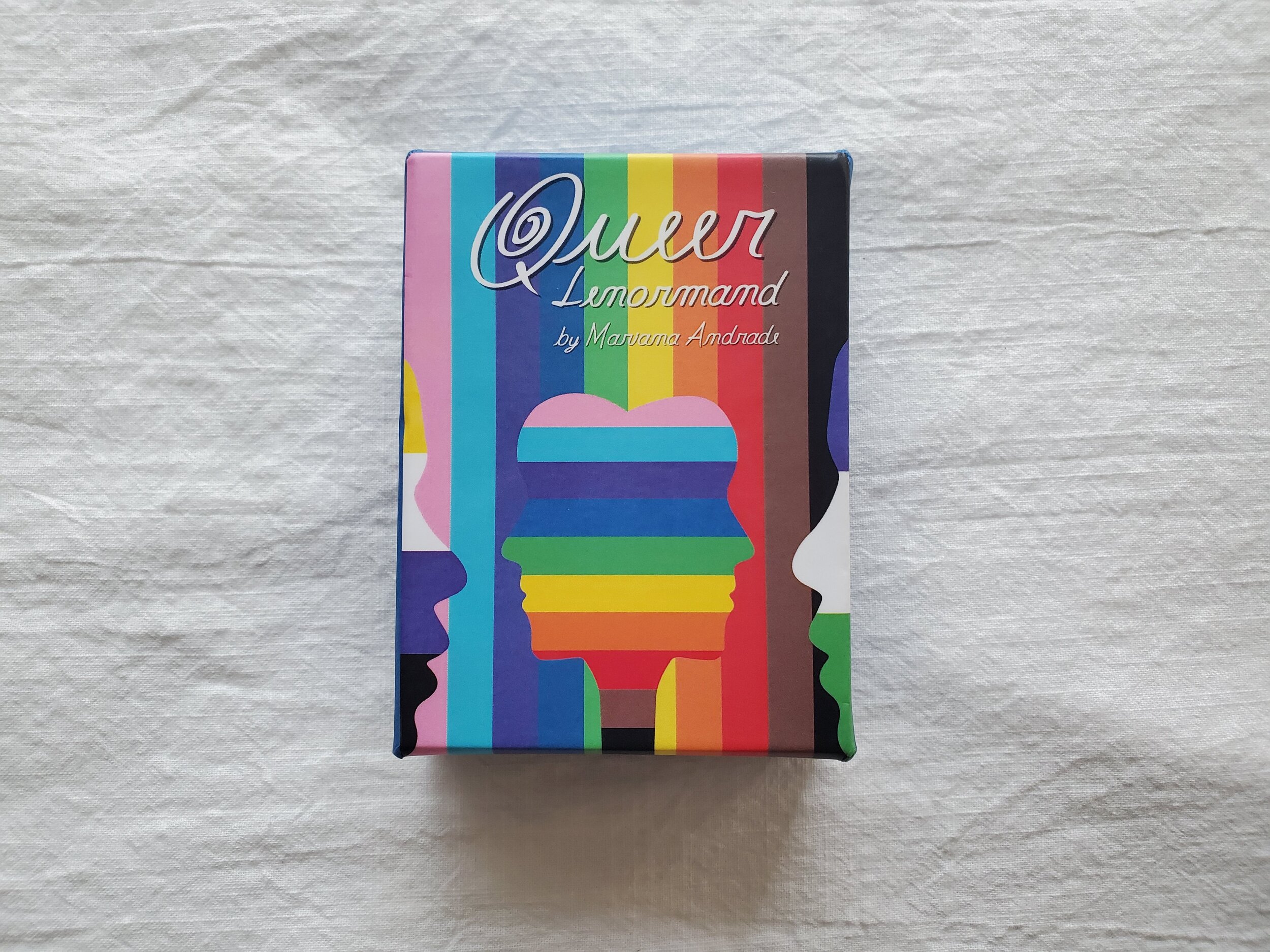
Deck: Queer Lenormand

Publisher: Self published

Writer & Artist: Mariana Andrade

Overall Rating: 10/10

Cardstock: The cardstock is on the thin end of standard, more like cards that come with a board game than something like a pack of poker cards. But they’re easy to riffle shuffle.

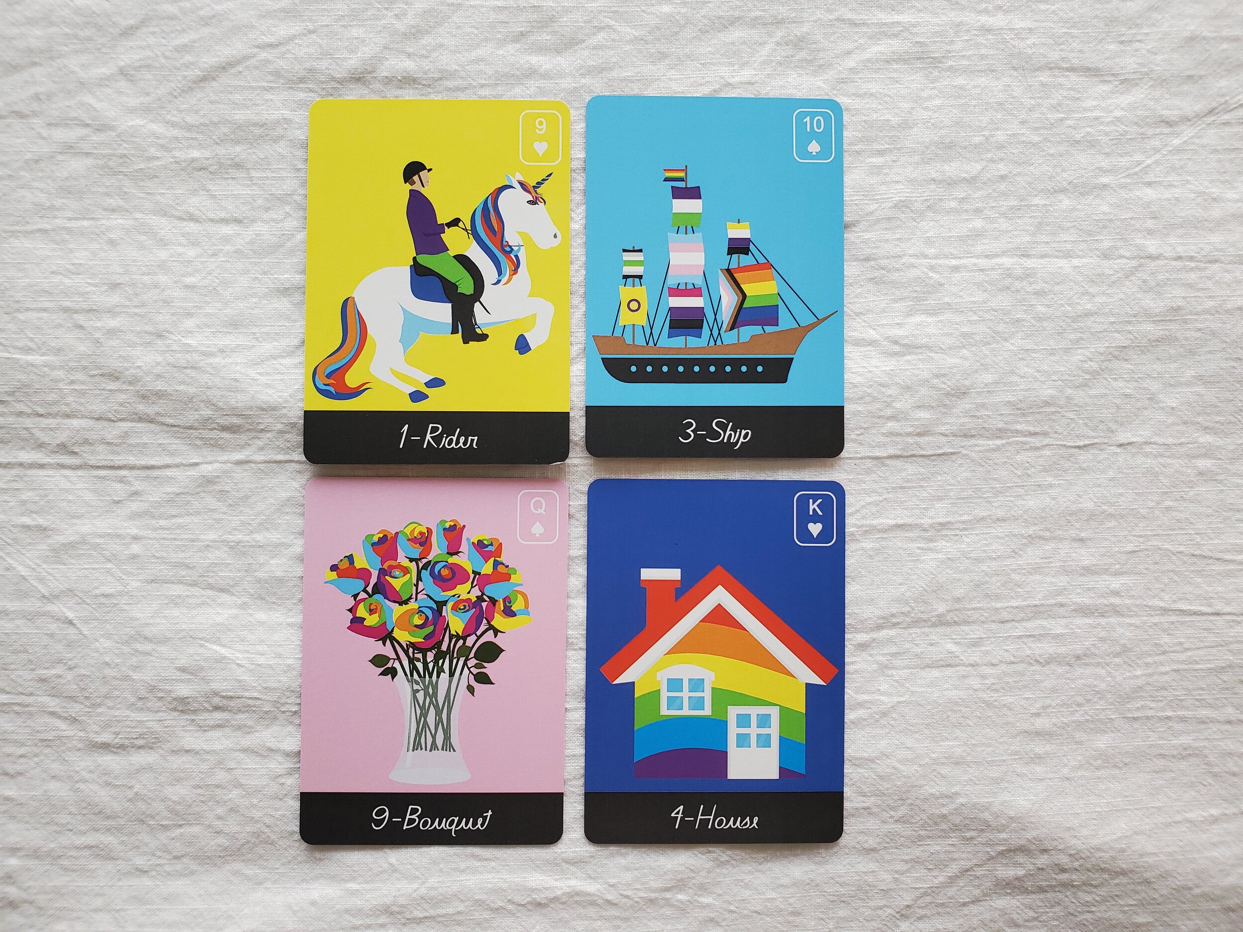
Artwork: The artwork is a digital illustration style with a low amount of shading that reminds me of old scum pop art. It’s vibrantly colorful, as one would hope! There are a rainbow of background options, each chosen to contrast the illustration.

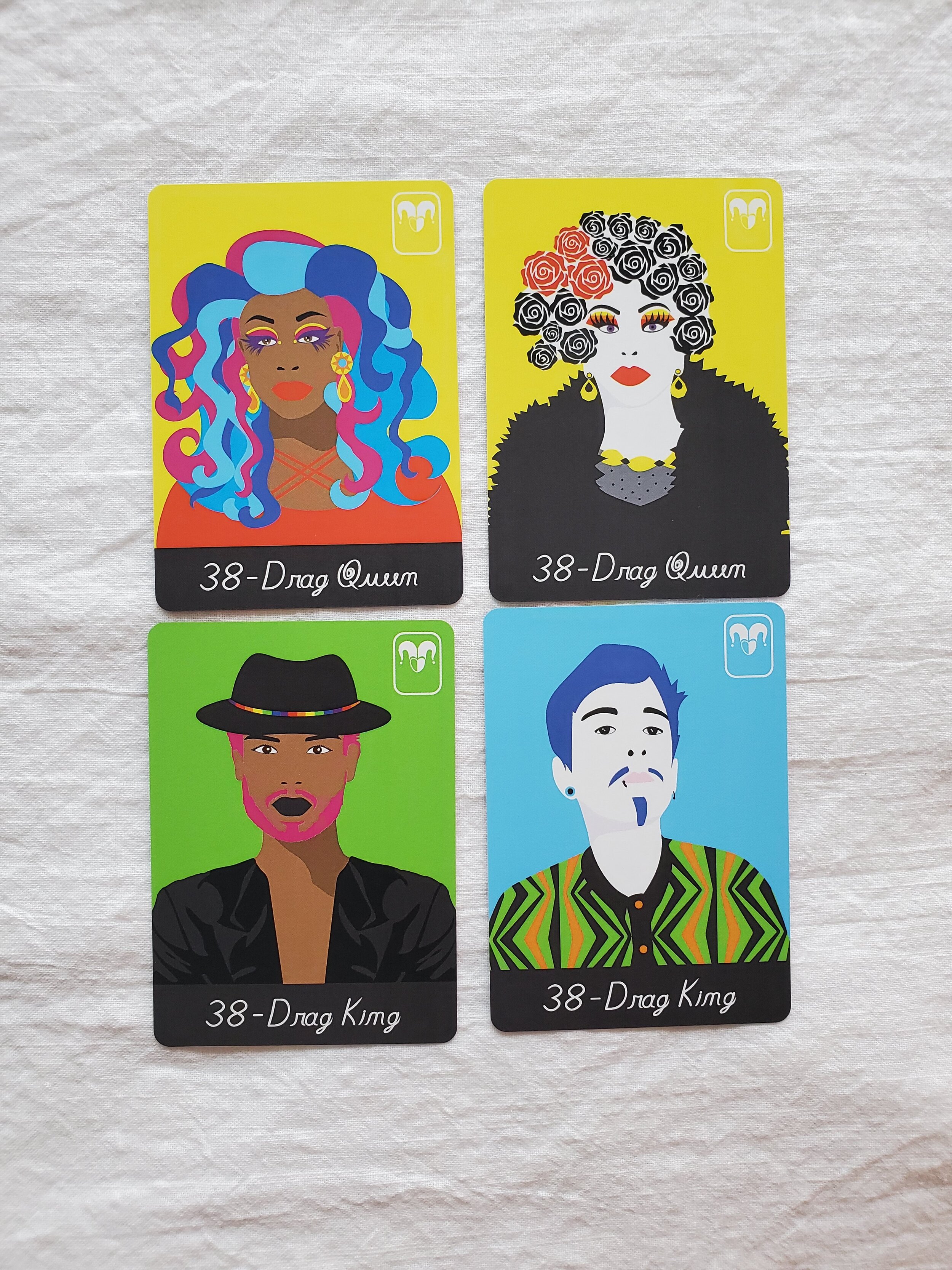
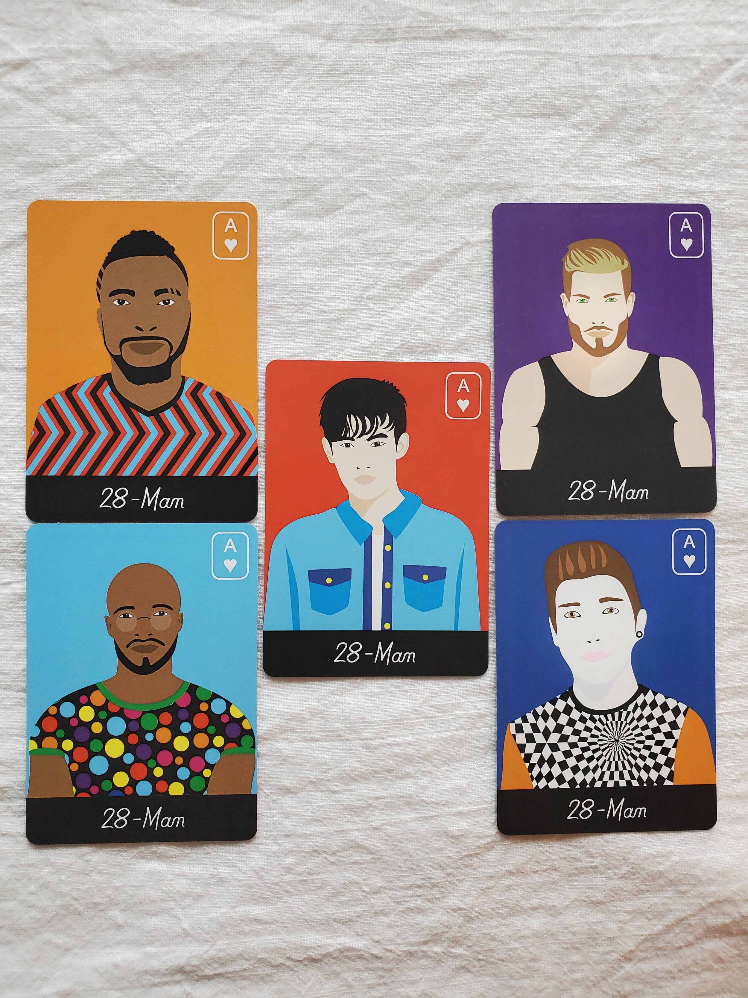
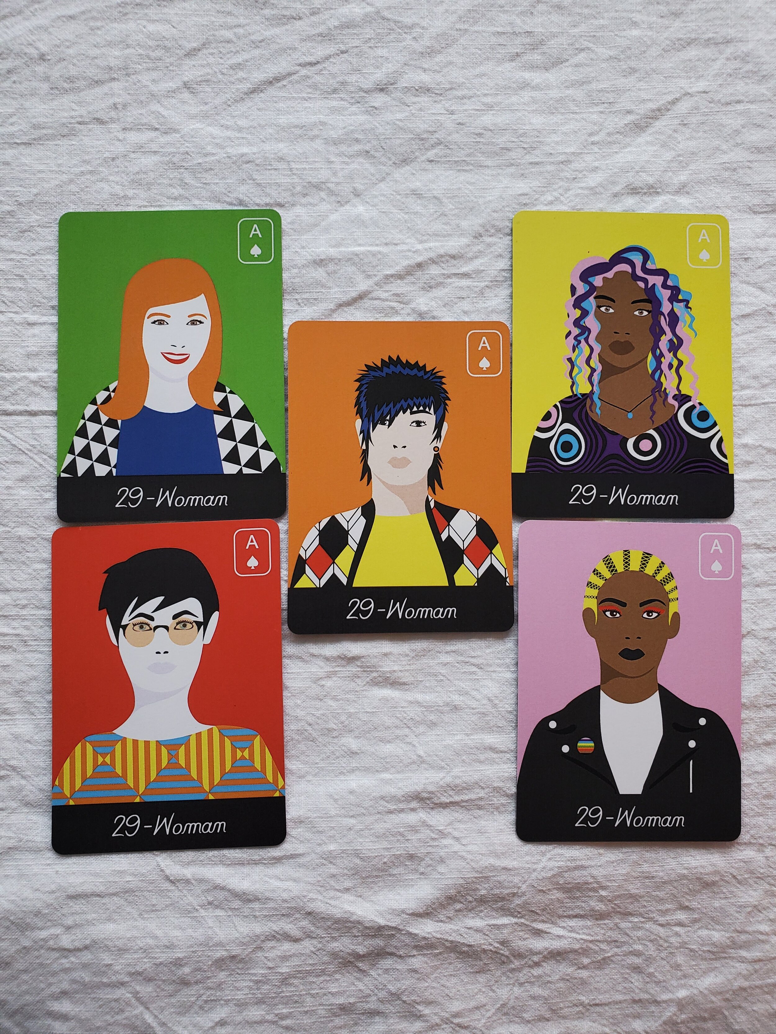
People Cards: I’m adding a section for this, because where this deck really shines is the wealth of options available for Person cards. There are only two Child cards (one with light skin and one with dark skin), but there are five each of “Woman”, “Man”, and “Person” cards, with a variety of skin tones and presentations, as well as two “Drag Queen” and two “Drag King” cards, each with light skin or dark skin options.

Book: The book has a decent sized paragraph and a list of keywords for each card. The “Man” and “Woman” cards also invite the reader to think outside the box about femininity and masculinity, while the “Person” card explicitly refers to people outside the gender binary. The paragraph for the two drag cards talks about our ability to explore binary energy, no matter what our actual gender is, if we have one. The booklet also gives a couple of brief spread examples. I do wish it gave a little more info on the Lenormand system itself, though.

Likes: I love the art and I love the diversity of the people cards, it does make it a lot easier to read for more people, and for my clients to see themselves reflected in the cards

Dislikes: I do wish there was a third option of skin tone. The five options in the “Man”, “Woman”, and “Person” cards include two people with light skin, one person with light skin who seems East Asian, and two people with dark skin, but no medium tone. Still, it’s way more diversity than usual!

Overall Recommendation

This is the deck I most commonly bring with for reading in person. The artwork is colorful and engaging, and people enjoy selecting a card for themselves and their partner or whomever they’re asking about. The box is also two parts and pretty sturdy, so it travels well. I personally love buying indie decks, especially from queer creatives, and I’d recommend this deck to anyone – with the single caveat that if you’re new to Lenormand you might want to pair this deck with a book on the system itself, since it does read differently than either tarot or regular oracle cards.

Open post

Tarot Deck Review: Oriens Tarot/Oriens Animal Tarot

Deck: The Oriens Tarot/ The Oriens Animal Tarot
Publisher: Ambisun / Rockpool
Artist: Ambisun
Writer: T.D. Cloud
Overall Rating: 9/10

Note: I have the first edition of this deck, through Kickstarter, and I am not sure what all has changed in the second edition through Rockpool, so while this review may accurately reflect the new edition, there are likely to be small changes, especially to the box and the cardstock.

Cardstock: The cardstock on the first edition is somewhat plastified or very laminated, and although the cards aren’t too shiny or slick, they flex and shuffle very well. I’m a huge fan!

Artwork: The artwork is really bright and clear despite the dark background color, and all the animals (and insects are depicted recognizably and detailed, without being either cartoonish or hyperrealistic. I wasn’t sure how I felt about the neon colors at first, but I liked the art style and the colors really grew on me. I will say though, this may not be the deck for people squeamish about insects or spiders. It says “animals” but there are insects and sea slugs and the like, too. I think each animal/insect image does a pretty good job of illustrating the card meaning, too, without being based too heavily on the Rider-Waite-Smith imagery.

Book: With the Kickstarter first edition, I got a full-length ebook. I have no idea if the new deck has a full book, a Little White Book, or an option for both, so keep that in mind. The ebook I have has keywords for both uprights and reversals, a short paragraph about the animal chosen and the imagery, and then a paragraph each for upright and reversed divination meanings. As an experienced reader I don’t refer to the paragraphs about the meaning much, but I do really like the paragraph about what animal was chosen, and why.

Likes: I love the artwork, and how well these shuffle. I think this deck lends itself well to intuitive reading, as the imagery is so expressive.

Dislikes: The neon-on-dark took a little while to get used to, but that’s not really a “dislike”. I don’t really have any dislikes for this deck, just the warning that there are quite a few insects and also a spider, in case that’s not your thing.

Overall Recommendation

This is one of the most popular decks in my shop. Clients seem to really connect with the artwork and the meanings, and the artwork is very beautiful and striking. It also avoids many of the depiction problems that decks featuring mainly human figures have: namely, a lack of inclusion of different skintones, genders, body types, ability levels, ages, etc. My only hesitation in recommending this deck to beginners and seasoned practitioners alike, is that I am not sure what the cardstock is like for the second edition!

Open post

Tarot Deck Review: Emerging from Darkness

Deck: Emerging From Darkness
Writer & Artist: Robin L. Cole
Publisher: Self-Published
Overall Rating: 6/10

Cardstock: These cards are standard tarot sized with a semi-matte texture, and they riffle shuffle pretty well. The edges are gilded in a silver glitter but after the first few uses they didn’t seem to really shed flakes. They riffle shuffle pretty well, but the edges aren’t smooth, which means I have to take a little more care than I might normally, when shuffling. The print job is what you’d expect from a high-quality deck.

Artwork: The artwork is mostly black and white, but there are colored labels and some muted color throughout. The sketch-like style features a lot of crosshatching for shading and depth, and it’s a little strange to me to be looking at that kind of artwork up close, since it is a little busy. I think the art style (and thus the deck) looks better from a distance, but that might just be a personal preference. I think the sketch-like style does lend itself well to the central metaphor of the deck, the interplay of light and dark, even if I personally find it a little difficult to read this deck intuitively based on the artwork. Besides my difficulties with the crosshatching though, I do find the artwork to be very emotionally evocative.

Book: The included booklet is more of a pamphlet – approximately three words per card – but the deck did come with the option of a full sized book or an ebook: “Emerging from Darkness: Using Tarot for Personal Shadow Work”. I bought the physical copy of the book, and I’ve found it very useful. There are a few chapters at the beginning that serve as a decent introduction to shadow work just in general, and the included tarot exercises have proved very fruitful for me and others.

Likes: I really like that this deck and book are meant to work together, to guide the user in one of the most important kinds of growth, which is also one of the most undervalued and neglected! That is really what drew me to this deck, the idea that it could really help me and my clients when we’re struggling with our own personal shadows.

Dislikes: It’s really a minor thing overall, but I find the coarse size of the crosshatching in the artwork to be a little distracting.

Overall Recommendation

I think this deck has a space in my collection more for the book than for the deck itself. They’re a team that works well together, but I think if they were separate and not so intrinsically linked, I might just have bought the book and skipped the deck. As it is, though, I do like them as a team. I just don’t find myself reaching for this deck when I have other types of questions.

Open post

Tarot Deck Review: Dark Exact

Deck: The Dark Exact Tarot
Writer & Artist: Coleman Stevenson
Publisher: Self-Published
Overall Rating: 7/10

Cardstock: These cards are a different shape than the standard tarot card, a bit more square, more like some oracle decks I own, but larger than poker size – approximately 4 inches x 3 inches. They have a semi-matte texture, and they riffle shuffle pretty well. My only complaint any the cardstock is that small dings to the edges tend to expose the white of the card interior, which is in sharp contrast to the black face of the cards. But one could always take a sharpie to the edges.

Artwork: The artwork is very minimalist, tarot symbology pared down and distilled to its key essences. The minor cards are mostly pips, but arranged in an evocative manner with the occasional additional symbol, like an alchemical elemental triangle, and the heart in the Three of Swords. The Majors have more detailed images but still usually one main element: a flower bulb for The Hermit, lines on a person’s palm for Judgement, an ouroboros for Death.

Book: The booklet is very short and has very small font but manages to pack some really good keywords for upright and reversal readings of all the cards. It also has a very brief explanation of tarot in general, and two spreads: past/present/future, and a Celtic Cross. There is also a full sized guide book, but I haven’t purchased that (yet?) and can’t speak to its contents or quality.

Likes: I think that this deck really does what it set out to do: be a minimalist black and white, very readable deck. It fills its aesthetic niche very, very well. I also think that the inclusion of a second Fool card, so that there’s one for the beginning of the journey and one for the conclusion is a really interesting touch.

Dislikes: I think I might’ve liked these cards better if they were actually poker sized and if the edges were bonded or coated somehow but those are really very minor detractions and very personal preferences.

Overall Recommendation

I do really like this deck, I think it’s a great addition to my collection and really is the best of the black and white decks I was looking at with more minimalist artwork. It’s a nice counterpoint to some of my busier fantasy art decks. But I’m not sure I’d recommend this deck for a newbie reader or for someone reads more intuitively based on what in the artwork draws their eye. A newbie reader might be able to learn with this deck if they also buy the full sized guide book, but without having seen the book I couldn’t say for sure.

Tarot Deck Review: The Numinous Tarot

Deck: The Numinous Tarot
Publisher: self-published, Numinous Spirit Press
Writer & Artist: Cedar McCloud
Overall Rating: 10/10

image (c) Numinous Spirit Press

Cardstock: It’s pretty thick without being too stiff, and has lovely gilded edges. So far it’s holding up very well to moderate usage for the past year or so. It feels pretty good to riffle shuffle, and the cards don’t stick much but they are pretty glossy.

Artwork: I don’t think I’ve ever seen a deck with artwork this representative. Age, race, ability, gender, size – the artwork is truly diverse. Some of the cards don’t have people on them at all, and those are all gorgeous as well. The attention to detail here, and the patterns on everything from the floors to the clothing, are very impressive. It’s a riot of color!

Book: This deck comes with a full paperback guidebook, not a LWB, with each card in black and white. The Major Arcana have about two pages each, and the Minors just one, but there’s a lot of material here, from descriptions of the scene itself, to keywords and thought-prompting discussions of both upright and reversed meanings. The language is pretty gender-neutral throughout, and the meanings are immersed in themes of social justice and healthy boundaries. The writing style is very accessible.

Likes: I love the diversity of the artwork and how queer it is, from depictions of gender-non-conforming folks, to the subversion of traditionally gendered tarot cards. Instead of Page, Knight, Queen, King, we have Dreamers, Explorers, Creators, and Mystics. The High Priestess becomes The Diviner, The Empress is The Nurturer, The Emperor is The Founder, The Hierophant is The Visionary. They are all still numbered for easy recall. Also, The Devil has been aptly renamed The Shadow, Judgement is now The Awakening, and McCloud added a 23rd Major, called The Numinous (whence the deck title). Suits have been renamed as well, but follow the traditional elements: Candles for Fire, Bells for Air, Vials for Water, and Tomes for Earth. The deck is at once tarot radically reimagined, and also familiar to students of the Rider-Waite-Smith system.

Dislikes: I think my only complaint is that some of the artwork is a little inconsistent, with some cards feeling more polished and some more sketchy, but there might be an intentional pattern to that seeming inconsistency.

Overall Recommendation

If you want a radically accepting queer-friendly deck that has truly diverse representation, you need this deck. I’ve been bringing it to pagan events just to show people! And for an indie deck, it’s really not very expensive. The artwork is very evocative, and is perfect for either a collector or an intuitive reader. It may take a little longer for students of the RWS system to get used to than the sort of decks that simply copying RWS imagery with cats or the like, but it isn’t an entirely new system and I found the transition fairly easy.

This is also my deck of the month for my Patreon for June, in honor of Pride Month!